This is a guest post by Linnart Felkl, of supplychaindataanalytics.com
Supply chain network design can benefit greatly from spatial data visualization. For example, transparency in a warehouse relocation project can be greatly improved by visualizing material flows and critical transportation routes as well as e.g. spatial customer location distribution. In this blog post I present tools that can be used for this. All of the tools presented by me are available as packages or modules available in at least Python or R. Hence, they can be used for free. Moderate data analysis skills in R or Python are required to be able to apply these tools.
ggmap in R allows for map-based plots and animations
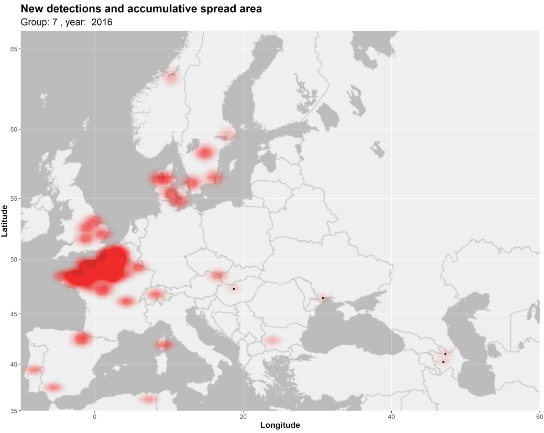
If you are used to R you will know ggplot2 for data visualization. You can think of ggmap as an extension of ggplot2. ggmap allows for map-based plots. Here is an example of a k-means density plot that I created as part of a research project for a major German university.
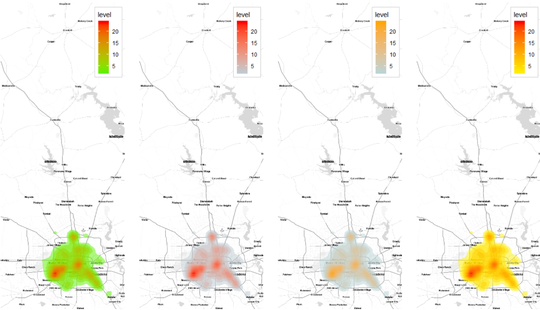
And here is another example, comparing different kernel density plot coloring themes for the same data.
ggmap applies the same “grammatics” as ggplot2. This means that if you are used to working with ggplot2 you will be able to generate plots in basically the same way as you are already used to. Another good thing about ggmap is that it (like ggplot2) is compatible with gganimate. This means that you can use ggmap in order to be able to create map-based animations. You can see how to do this in another blog post that I published on SCDA: Spatial data animation with ggmap & gganimate.
Leaflet is available in both R and Python (among other languages)
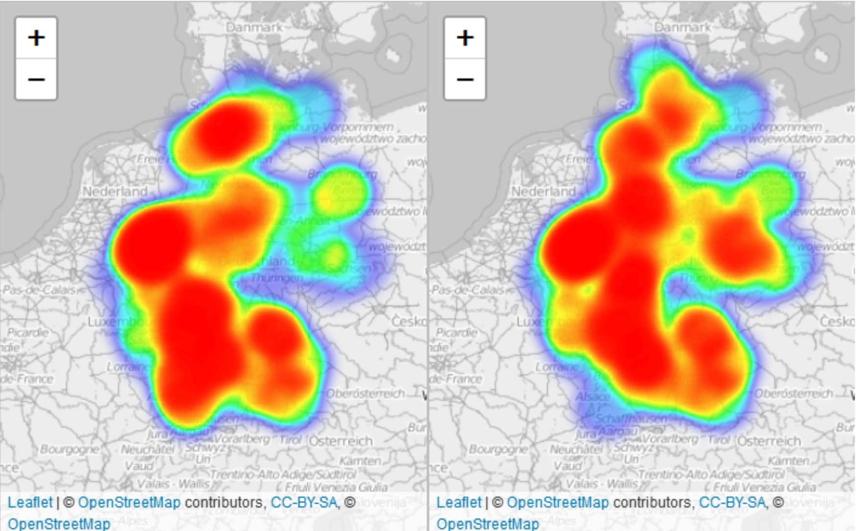
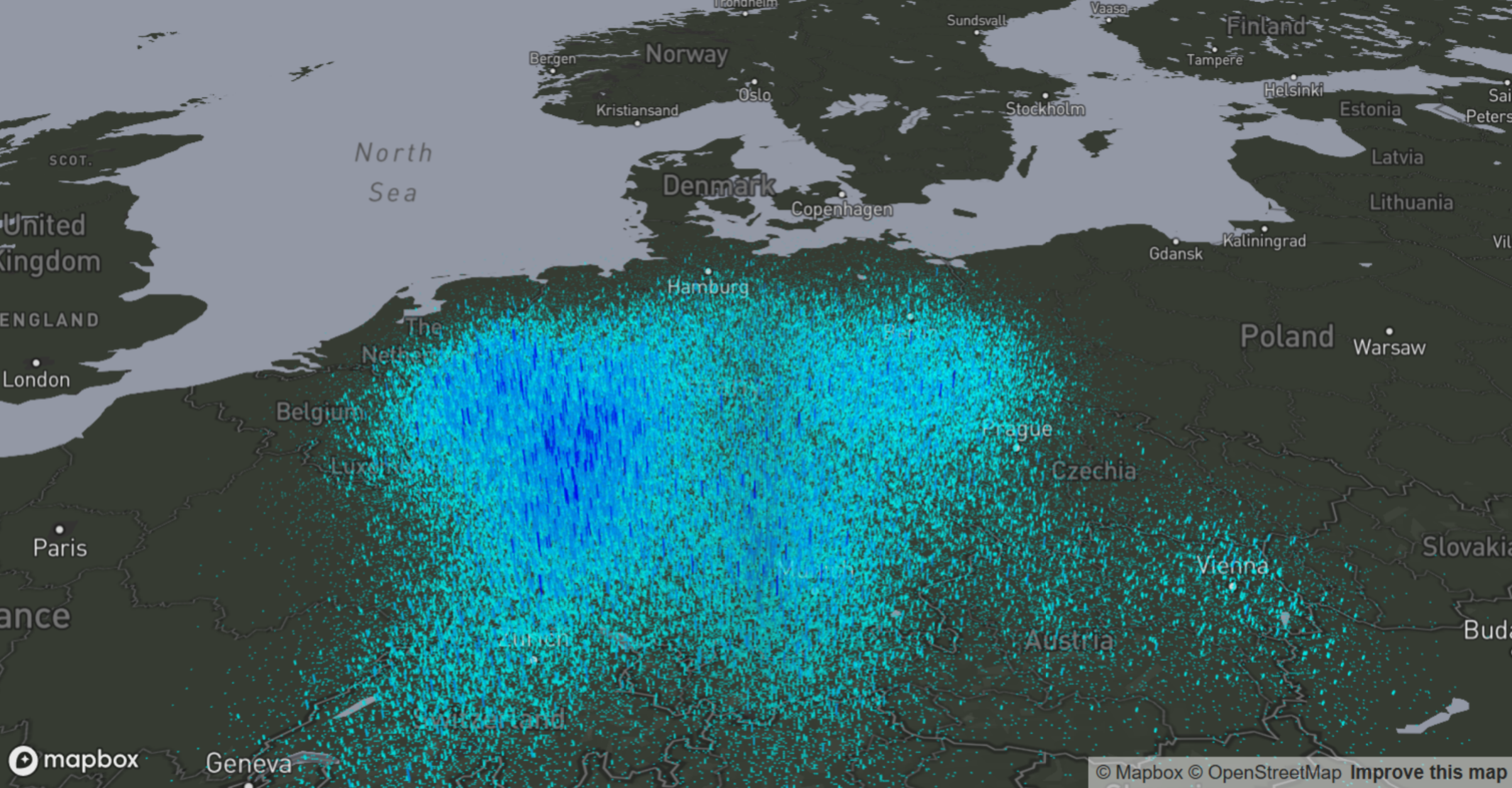
The Leaflet library can be accessed in R and Python. It enables you to draw good looking heatmaps. You can see an example below.
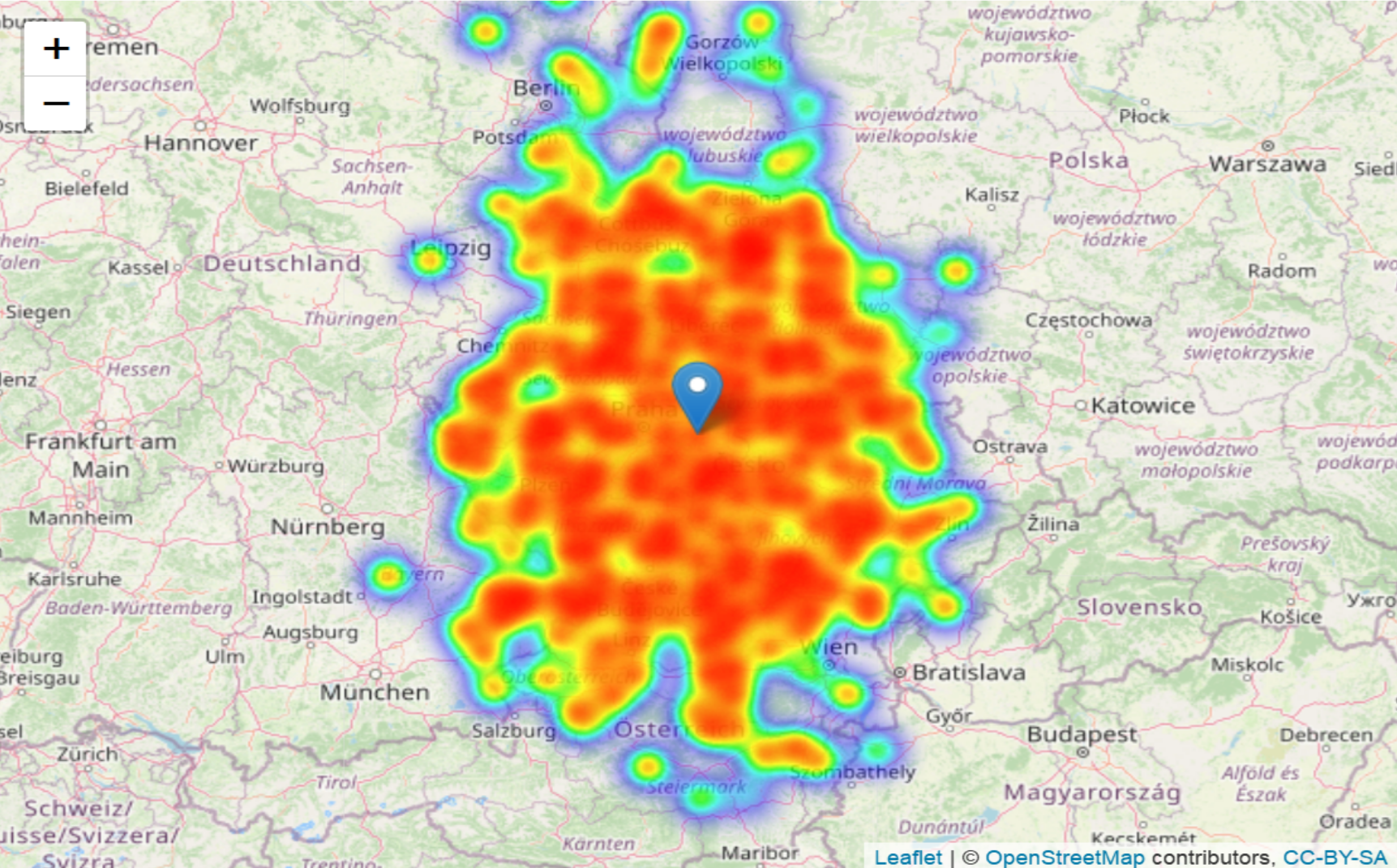
Above example shows a heatmap that illustrates a monte-carlo simulation in which I randomized customer locations to assess the risk associated with warehouse allocation. Below is another example comparing spatial distribution in Google search trends for two keywords.
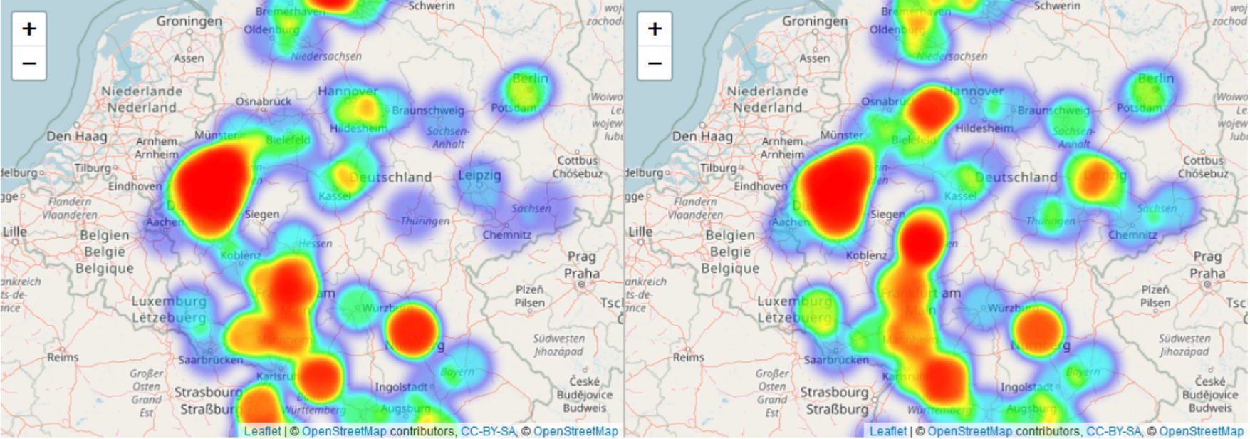
Using Leaflet in R or Python, much like other tools, allows users to adjust the tiles and coloring themes of the map. It is also possible to adjust heatmap visualizations by e.g. adjusting the radius of overlapping circles. Below follows another exemplary visualization of the same data.
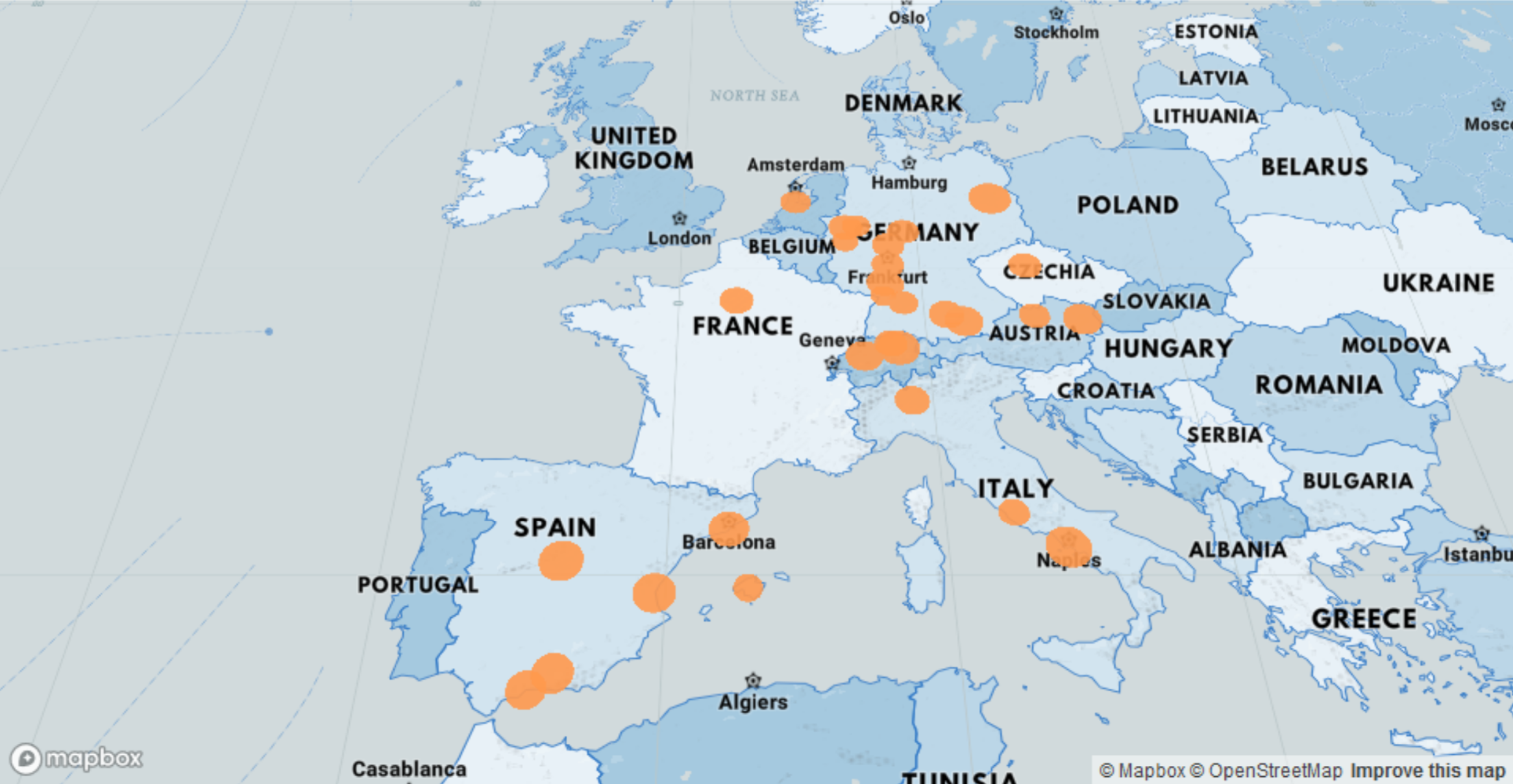
Markers or custom icons can be used for visualizing spatial distributions as well. Here is a marker plot that I created with Leaflet in R.
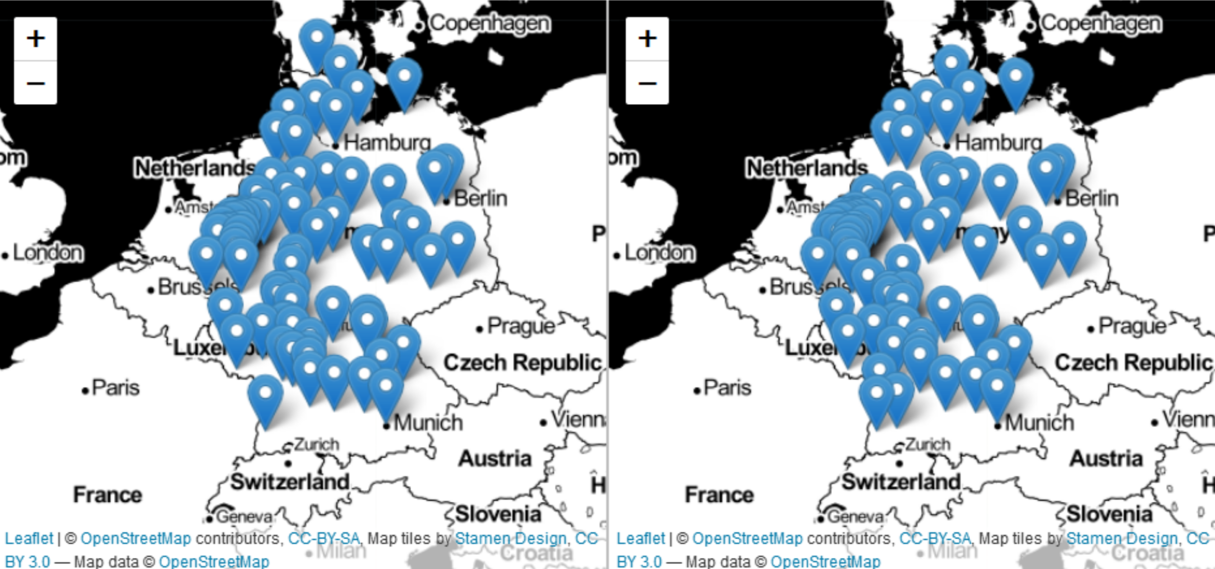
Back when I developed these examples I was comparing Google search trends for the keywords “Pizza” and “Hamburger” in Germany. Leaflet allows me to customize marker icons, as you can see in the plot below.
Visualizing and comparing spatial distributions in this way e.g. contributes to a better understanding of relevant customer groups and markets.
In R, Leaflet integrates nicely with Shiny R
Another great thing about Leaflet (in R) is that it integrates smoothly with Shiny R apps. Below is a screenshot of a very simple Shiny R app with a Leaflet heatmap visualization that I once made.
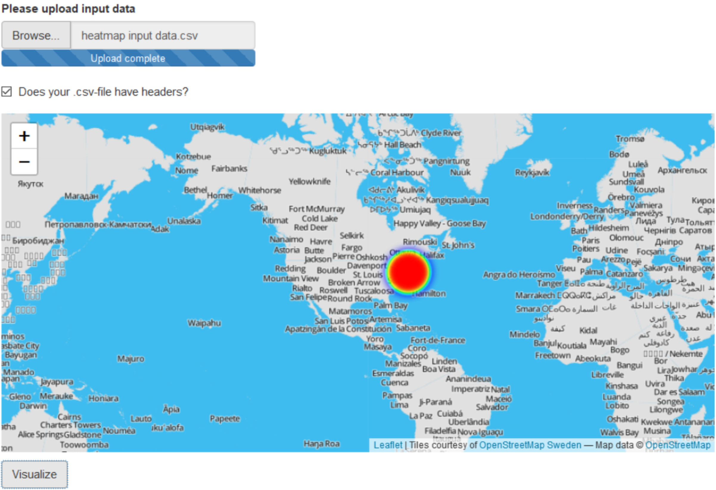
The Shiny app allows users to upload a csv-file with input data. That input data is then geocoded and eventually visualized in the form of Leaflet heatmap.
With leaflet.minicharts you can generate map-based charts
leaflet.minicharts is an extension to Leaflet maps and the Leaflet package in R. It currently supports three types of charts: Bar charts, pie charts and polar area charts. In the figure below you can see how I created a map-based pie chart visualization for a retailer of automotive spare parts. The map compares pump vs. sensor sales revenue by state. The bigger the pie, the bigger the total sales volume with the respective state.
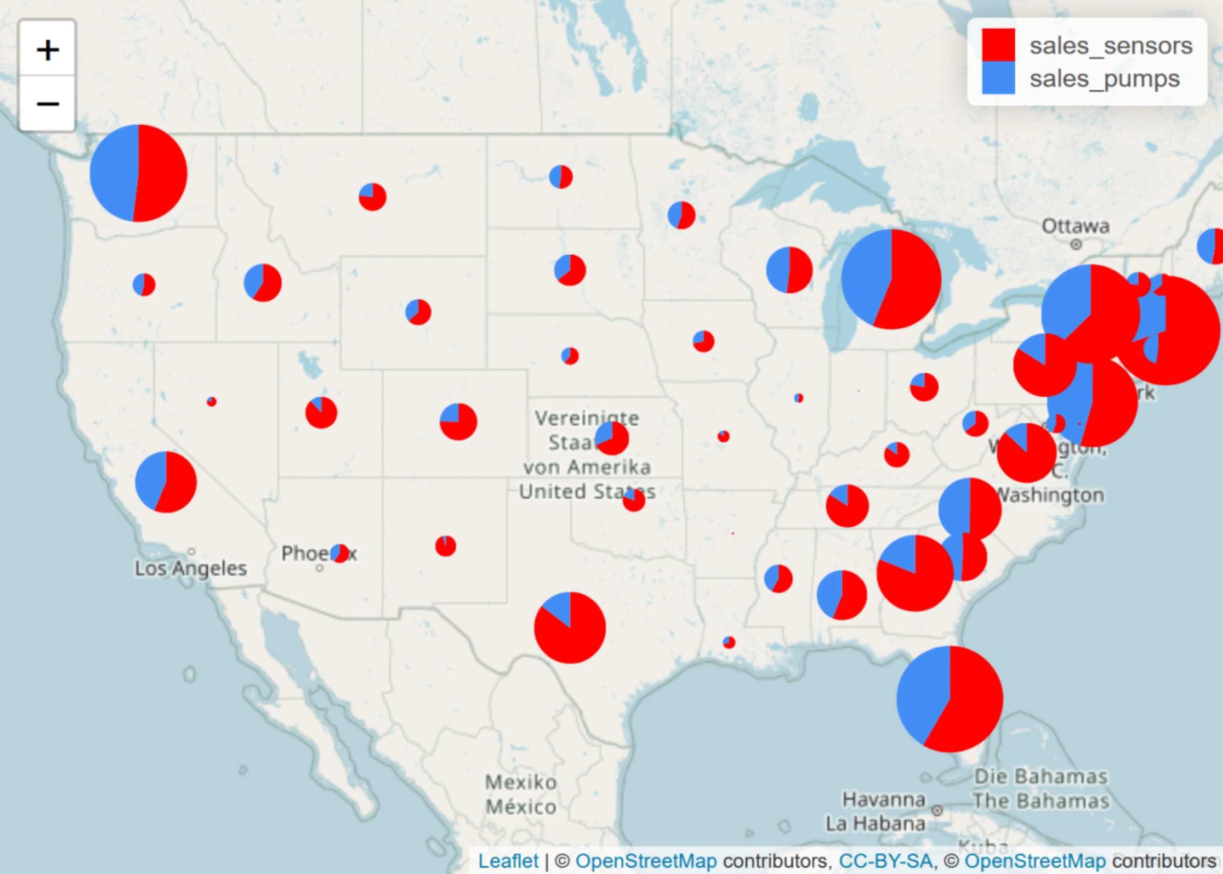
The nice thing about leaflet.minichart is that it is compatible with both Leaflet (obviously) and Shiny R. Again, that means that it is possible to construct interactive Shiny R apps that offer responsive map-based charts.
The leaflet.minicharts package in R can also be used to create map-based animations. This is especially useful when communicating time-based spatial data trends. A package like leaflet.minicharts will allow you to walk through each year, month or day one by one, without having to plot multiple maps. It all can take place in just one map.
deckgl can be accessed in R and allows for 3D plots
Using deckgl in R spatial data can be visualized on top of mapbox tiles in 3D. Here is an example showing an artificially generated distribution in the form of 3D bars on top of a mapbox map.
Besides 3D bar plots other types of visualizations can be generated with deckgl. Here is another example showing a map-based scatterplot.
Flight routes (line paths), tuck routes (arcs), and much more can be visualized with deckgl, too. All of these plot types can be combined. For example, flight and truck routes can be visualized on a map that shows customer locations in the form of a scatter plot.
Concluding remarks on free tools for spatial data visualization
In this article I introduced a couple of free tools for spatial data visualization and analysis in R and Python: ggmap, Leaflet, leaflet.minicharts, and deckgl. These tools will enable you to communicate results from spatial data analysis. Where are my customers located? What are my main material flows? Which regions generate the most sales? Where would be a good place for a new sales store or distribution center? Questions like that call for spatial data visualization. And in this article I presented some tools that enable you to create such visualizations for free.