The conclusion of this white paper will be published on a later date on our website. To download the complete white paper now, click here.
By Jennifer Houle
For additional background, read this case study.
A national restaurant chain approached the Data Driven Supply chain team with a problem: despite high days of supply in their Distribution Centers, their restaurants were regularly out of stock of popular items. Why, and how could we help fix it?
We developed an inventory simulation toolset which linked the client’s supply chain data and management priorities to recommend inventory policies. By applying this toolset, the restaurant chain could improve their restaurant in-stock levels without significantly increasing cost or DC utilization.
In this article, we present the basics of our inventory simulation toolset and an example from the restaurant chain client. As a takeaway, you will see how you can use this method to optimize your inventory levels, no matter what your industry.
Background
Unlike many restaurants which depend upon a distributor like Sysco or US Foods, our client manages its own nationwide network of owned and leased distribution centers. The DCs receive product from suppliers and replenish to restaurants multiple times per week, or daily for the busiest locations.
If the distribution centers don’t hold enough stock to meet demand, restaurants may run out of critical ingredients or supplies, negatively impacting sales and customer experience. On the other hand, holding too much stock at the DC leads to spoilage, storage costs, and unnecessarily tying up working capital.
To balance these competing concerns, the restaurant chain walked the tightrope of inventory management, looking for the “Goldilocks” inventory level.
The restaurant chain uses an (r,Q) policy to manage their inventory. When a SKU’s inventory position (on-hand inventory + in-transit inventory) falls below a certain level at a distribution center (replenishment point or r), an order to the supplier is automatically placed for a fixed quantity (replenishment quantity or Q), which arrives after a lead time of L days later.
This method leads to the well-known inventory sawtooth plot, as seen in the figure below. In the sawtooth, DC inventory levels (on-hand quantities) spike upon receiving goods from the suppliers, then steadily decline as orders from the restaurants are fulfilled.
Once the inventory level hits the reorder point, safety stock is consumed to fulfill demand over the lead time, until the supplier shipment arrives and we repeat the process again.
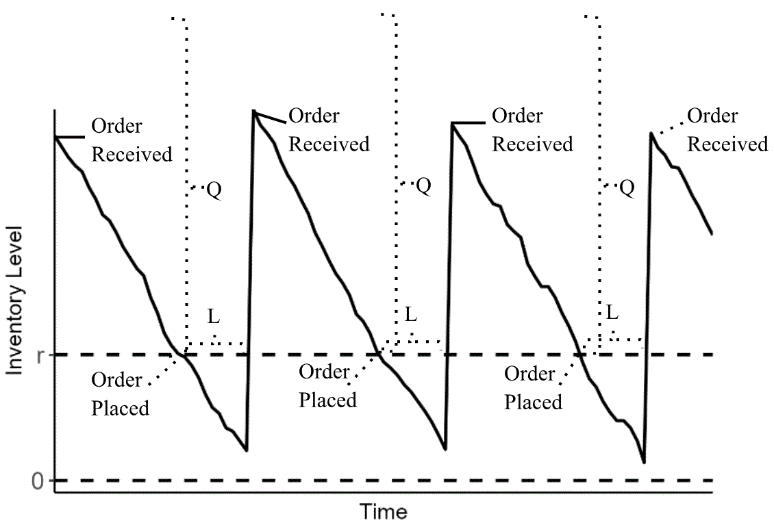
(click image to enlarge)
But how do we decide how to set r and Q? The restaurant chain’s inventory policies were not optimal, leading to excess inventory for some SKUs and shortages for others.
Classic supply chain theory makes several assumptions about supply and demand to arrive at formulas for r and Q. A key assumption of these formulas is that demand from the restaurants to the distribution centers is normally distributed. This works well in academic formulas but falls down in practice where demand may be lumpy, highly seasonal, irregular, or anything in between. For example, peanut butter might be regularly in demand, but with variability. Iced coffee, on the other hand, may be highly seasonal with demand spikes for high temperatures:
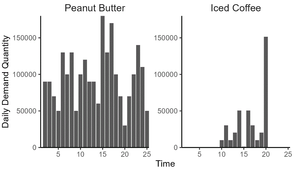
(click image to enlarge)
We can use a standard formula to calculate r and Q for peanut butter because demand is regular, but not iced coffee because demand is spiky and seasonal. But even if we could use a formula, there’s another problem. These formulas are designed to minimize costs, ignoring other considerations. For example, the classic reorder quantity calculation gives a Q which minimizes holding cost and ordering cost at a given level of demand:
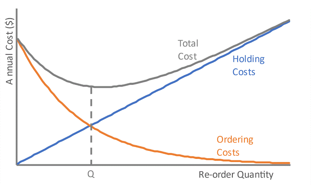
(click image to enlarge)
But what if other metrics besides holding and ordering costs are more important to the business? What if reducing distribution center utilization is of paramount importance to the Chief Supply Chain Officer (CSCO)? What if lowering transportation costs is a priority? If we want to use different trade-offs, what can we do instead?
Enter the Data Driven Supply Chain approach: inventory simulation using your real-world, historical demand data and forecasts.
Our team developed an inventory simulation toolset to test a comprehensive set of reorder point & reorder quantity (r,Q) values on real-world demand data. This enables you, as the supply chain leader, to not just receive one “optimal” inventory policy for a particular SKU and DC. Instead, we enable you to decide what is optimal given your business priorities.
This approach is highly flexible, as it supports a wide range of demand data, supply chain network configurations, and business priorities. However, it comes at the cost of data – it requires all of these properties to be known and measured. Our team will help scope the “art of the possible” in an engagement.
We applied our inventory simulation to the national restaurant chain’s network of suppliers, distribution centers, and restaurants in a proof of concept (POC). For each SKU/DC combination in a client-requested sample, our simulation recommended reorder points and reorder quantities that would meet a minimum 99% restaurant in-stock level and balance competing business priorities of cost and DC capacity utilization.
Next, we’ll demonstrate how we chose the “best” r and Q for peanut butter at the Omaha Distribution Center – balancing priorities for total cost and distribution center utilization, while fulfilling more than 99% of demand.
Jars of peanut butter arrive from supplier Lil’ Nutty PB into the Omaha Distribution Center, are held in stock, and are subsequently distributed to area restaurants:
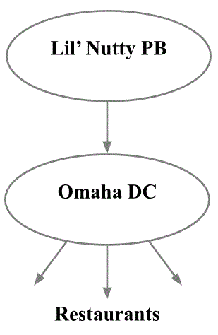
(click image to enlarge)
Average lead time from Lil’ Nutty to the Omaha Distribution Center is 10 days after an order is placed (lead time L=10). We know there’s an average daily demand of about 1,000 jars of peanut butter from the restaurants aligned with the Omaha Distribution Center. As such, average demand over lead time is 1,000 * 10 = 10,000 jars.
We can put all this together into a simulation tracking how inventory levels change based on supply and demand. Here’s an example with reorder point r = 10,000 jars and reorder quantity Q = 10,000 jars (both r and Q equal to demand over lead time).
On day 1, the Omaha DC starts with 10,100 jars of peanut butter in inventory with a demand from the restaurants of 832 jars. It has zero inbound deliveries on day 1, and no in-transit inventory.
| Day | Daily Demand | Inventory Level (Start) | Inbound Delivery | Inventory Level (End) | In -Transit | Inventory Position (End) | Unfilled Demand |
| 1 | 832 | 10,100 | 0 | 9,268 | 0 | 9,268 | 0 |
| 2 | 1,115 | 9,268 | 0 | 8,153 | 10,000 | 18,153 | 0 |
| 3 | 795 | 8,153 | 0 | 7,358 | 10,000 | 17,358 | 0 |
| 4 | 1,294 | 7,358 | 0 | 6,064 | 10,000 | 16,064 | 0 |
| 5 | 812 | 6,064 | 0 | 5,252 | 10,000 | 15,252 | 0 |
| 6 | 1,220 | 5,252 | 0 | 4,032 | 10,000 | 14,032 | 0 |
| 7 | 904 | 4,032 | 0 | 3,128 | 10,000 | 13,128 | 0 |
| 8 | 1,289 | 3,128 | 0 | 1,839 | 10,000 | 11,839 | 0 |
| 9 | 996 | 1,839 | 0 | 843 | 10,000 | 10,843 | 0 |
| 10 | 1,301 | 843 | 0 | 0 | 10,000 | 10,000 | 458 |
| 11 | 1,005 | 0 | 10,000 | 8,995 | 10,000 | 8,995 | 0 |
| 12 | 988 | 8,995 | 0 | 8,007 | 10,000 | 18,007 | 0 |
The Omaha DC ends day 1 with an inventory level of (10,100 – 832) = 9,268 jars of peanut butter on-hand. With zero in-transit inventory, the ending inventory position (inventory level + in-transit) is also 9,268 jars.
At the end of Day 1, our inventory position is below the reorder point of 10,000. This triggers an order of Q=10,000 jars, scheduled to arrive at the beginning of Day 11.
On days 2 through 10, there are 10,000 jars of in-transit inventory. The Omaha DC continues to fulfill restaurant demand from the safety stock, while the inventory position (on-hand + in-transit) is greater than the recorder point of r = 10,000 jars.
Unfortunately, the DC runs out on day 10 and stockouts occur: 458 jars of demand for peanut butter are unfulfilled on day 10. This causes the Omaha area restaurants to stop offering peanut butter and jelly sandwiches. Uncomfortable conversations between restaurant staff and the parents of picky-eater small children ensue.
On day 11, the in-transit inventory finally arrives, and peanut butter again goes out to Omaha-area restaurants. Toddler parents breathe a sigh of relief.
Defining fill rate as (1 – unfulfilled demand / total demand) x 100%, over 12 days, the fill rate was (1 – 458/12,551) x 100% = 96.3%. The average of daily fill rates was 97%.
However, we can measure this inventory performance in multiple ways. As with most supply chain metrics, definition is paramount!

Our restaurant chain client measures its inventory performance with an all-or-nothing fill rate: was all the daily demand fulfilled? If so, that day is a hit; if there’s any unfulfilled demand – even a single unit – that day is a miss. By that metric, their fill rate was 92% (11 of 12 days with all demand fulfilled).
Given that unacceptably low company-defined fill rate, perhaps we need to adjust our reorder point, reorder quantity, or both? But how can we pick better ones?
(Of course, reducing the lead time from supplier to DC also would help with service level and reduce overall inventory investment. We don’t cover lead time reduction in our article, but it can be incorporated into a client engagement; as can variability and unpredictability in supplier lead times.)
Here’s the inventory simulation plot for our example. As an orientation, the x-axis represents time in days; the y-axis is the Inventory Level (on-hand). In-transit inventory is not shown.
Inventory decreases as the in-transit order is awaited, and spikes on day 11 when it arrives. The missed demand from the stock-out on day 10 is shown as a red dot at y = -458, representing 458 jars of unfulfilled demand.
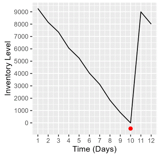
(click image to enlarge)
We can use this approach to simulate and test a range of inventory policies – a comprehensive set of r and Q values – on the Omaha DC’s peanut butter demand. This is the first step to picking a better reorder point and reorder quantity. This will be covered in depth in Part 2 of this whitepaper, to be published on a later date on this website.
To download the complete white paper now, click here.
 Jennifer Houle is a freelance data scientist who, at Data Driven Supply Chain, brings her data science expertise to help clients transform their supply-chain data to actionable insight. She can be reached via LinkedIn or jen@jhdatascience.com.