If you have not read Part 1 of this white paper, please first read it here.
To download the complete white paper now, click here.
By Jennifer Houle
For our Omaha Distribution Center and its peanut butter, the plots below show inventory simulations with reorder point r between 5,000 and 15,000 jars (5 to 15 DOS at an average daily demand of 1,000 jars), and reorder quantity Q ranging from 1,000 to 4,000 (1 to 4 DOS).
Each (r,Q) pair is its own plot on the grid. The x-axis is time, 100 days; the y-axis is the Omaha DC on-hand Inventory Level. The black line represents the inventory level sawtooth; red dots indicate daily unfulfilled demand. The further below y=0 the red dot is, the larger the unfulfilled demand. In-transit inventory is not shown.
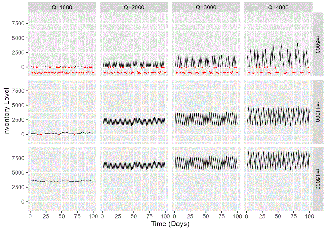
(click image to enlarge)
Behavior varies widely between the simulations. When r = 5,000 there are many stockouts (red dots). So these aren’t wise choices. If we eliminate these, there are still many possibilities which all fulfill customer demand. The next step of our Data Driven Supply Chain simulation approach is to measure how trade-offs among business priorities change over our r, Q simulation space.
To do this, we need to measure the performance of our inventory simulations. In this case, the national restaurant chain was most interested in cost and distribution center space metrics, and they had supporting data on item, supplier, and distribution center properties. From our simulation results, we could calculate mean DC utilization (in cubic feet) and total cost (consisting of transportation, holding, and procurement costs).
Here’s a sample of what the numbers look like for reorder point r=11,000 jars of peanut butter. As a reminder, the restaurant chain defines fill rate as the percentage of days with zero unfulfilled demand, so a fill rate of 95% means that there was unfulfilled demand on 5 out of 100 days.
| Reorder Point r | Reorder Quantity Q | Average Cubic Feet Used | Handling Cost ($) | Procurement Cost ($) | Transportation
Cost ($) |
Total Cost ($) | Total Unfilled Demand (Units) | Client-Defined Fill Rate
(% of Days With All Demand Filled) |
% of Units Demand Fulfilled |
|
11,000 |
1,000 | 3 | 1,010 | 363,636 | 626,550 | 991,262 | 1,191 | 95 |
99 |
|
11,000 |
2,000 | 18 | 1,016 | 365,817 | 634,088 | 1,001,339 | 0 | 100 |
100 |
|
11,000 |
3,000 | 22 | 1,016 | 365,756 | 633,877 | 1,001,166 | 0 | 100 |
100 |
|
11,000 |
4,000 | 27 | 1,010 | 363,727 | 626,864 | 992,214 | 0 | 100 |
100 |
At Q=1,000, some of the demand goes unfilled (the client-defined fill rate is 95%) so this isn’t a good choice. But for the remaining choices, what is the best inventory policy for navigating the tradeoffs between service level, cost, and DC capacity?
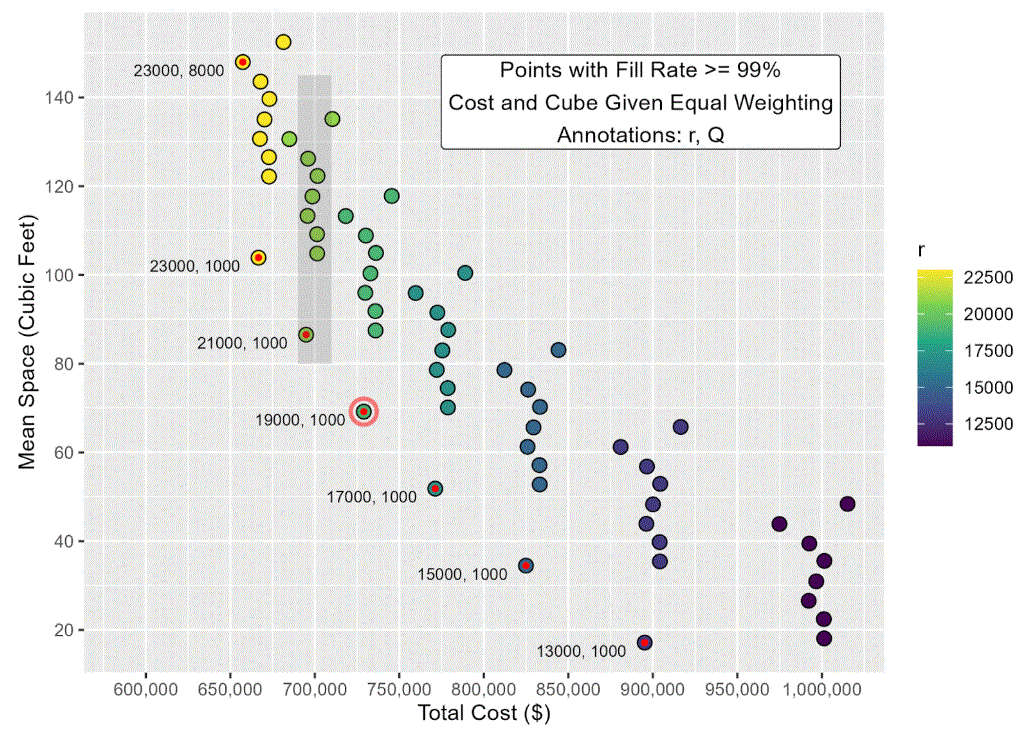
The restaurant chain client emphasized that a 99% or higher fill rate was paramount. After eliminating the (r,Q) combinations with a fill rate under 99%, we put the remaining options into our multi-objective optimizer.
In the following plot, each dot represents a single (r,Q) combination for peanut butter at the Omaha DC. (We ran far more combinations than shown in the plot above.) All have a client-defined fill rate of at least 99%. The x-axis represents the total cost of that inventory policy; the y-axis is the average cube used in the DC. Color indicates reorder point.
As you can see, there’s a general tradeoff between total cost and cube utilized. If you want to reduce the amount of DC space used to store Lil’ Nutty, you’re going to pay more – primarily in transportation costs.
However, it’s not an exact, linear relationship. (If you’re getting flashbacks to a boring lecture from Statistics 101, when you were either asleep or wishing you were – we’re not getting deep.)
For example, we can see there are about 10 different options of (r,Q) that yield about the same total cost of $700,000. But if we’re going to spend $700,000 (the shaded box on the graph), we might as well minimize our DC utilized space: about 90 average cubic feet, with r = 21,000 and Q = 1000. This is colored red and is at the bottom of the shaded area. If – and only if – we are going to spend $700,000, this is the best option.
By rinsing-and-repeating this process across the x-axis of total cost, we can create the “Pareto front”: the set of inventory policies that best show the tradeoffs between competing business priorities of cost and DC utilized space. In the plot, this Pareto front is the red-filled points, with (r,Q) values noted.
(click image to enlarge)
The “optimal” values of (r,Q) depends on whether space or cost is most important: and all meet the minimum 99% client-defined fill rate.
If these priorities are given equal weighting by supply chain leaders, the “optimal” (r,Q) is the one where these two trade-offs are balanced.
Putting the results all together, the best (r,Q) values which minimize both total cost and distribution center space are r=19,000 and Q=1,000 (circled red on the graph, at a total cost of $728,694).
These values can be input directly into ERPs, planning spreadsheets, and the like. This will ensure that the Omaha DC can meet its restaurants’ demand for peanut butter in a manner that best navigates the tradeoffs between cost and DC cube utilized.
Inventory simulation illuminates how complex trade-offs among business priorities can be tied to supply chain planning parameters (e.g. r, Q). This approach is not limited to a single item at a single distribution center. It can be applied to complex supply chain networks, with many items, suppliers, and multiple levels of distribution centers. The principles are the same: knowing demand and your supporting inputs (supplier, distribution center, and item properties), simulating inventory for a set of r, Q values, calculating your resulting performance metrics, and choosing those which balance your business priorities.
Implementing the results leads to happier customers (no more out-of-stock peanut butter), happier distribution center managers (no more too empty or too full buildings), and happier management (more filled demand and lowered cost is increased profitability).
Tradeoffs aren’t limited to two competing business priorities in our multi-objective optimization framework. We can also consider how to optimize inventory policies for multiple SKUs when our DC capacity – or our working capital budget – are constrained, and we can’t get everything we want. Though not covered in this case study – if you’re still reading this, thank you! – you can reach out to Data Driven Supply Chain for a demo.
To download the complete white paper now, click here.
 Jennifer Houle is a freelance data scientist who, at Data Driven Supply Chain, brings her data science expertise to help clients transform their supply-chain data to actionable insight. She can be reached via LinkedIn or jen@jhdatascience.com.